Branding
Packaging Design - Honey
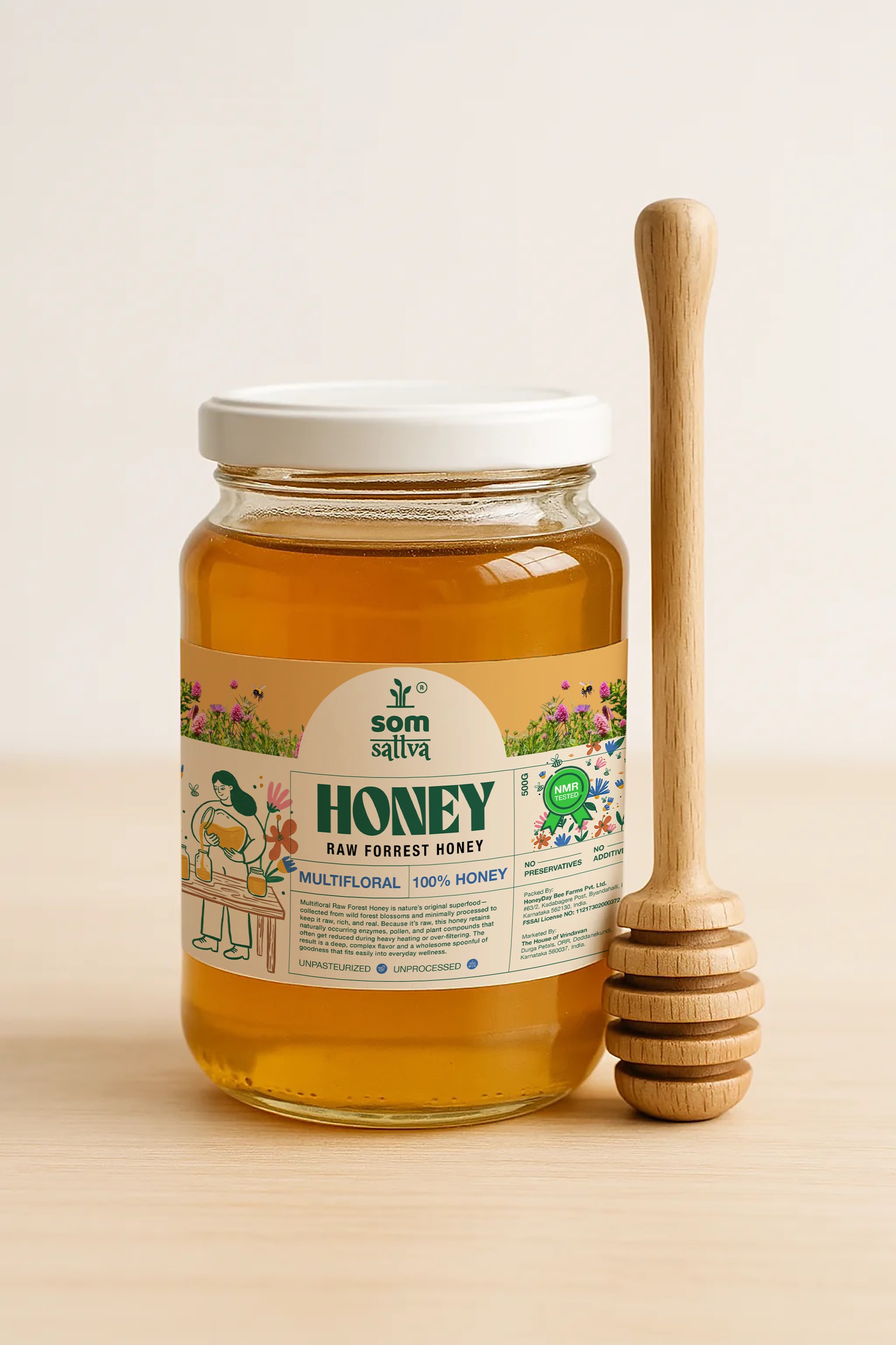
Somsattva, an organic honey brand. The concept reflects the brand’s natural and authentic essence through detailed illustrations that narrate the journey of honey—from harvesting at the source to its processing and delivery to consumers. The design emphasizes purity, sustainability, and a strong connection to nature.
Year :
2026
Industry :
FMCG
Client :
Som Sattva
Project Duration :
1 week

Problem :
The honey market is crowded with products that often look generic, making it difficult for consumers to distinguish between premium, natural, and authentic honey brands. The objective was to create packaging that communicates purity, trust, and a strong connection to nature while standing out on both digital and retail shelves.

Solution :
The packaging was designed with a clean, modern, and nature-inspired visual language. Warm earthy tones reflect the natural richness of honey, while illustrated floral elements highlight the product's forest-sourced origins. Clear typography and a structured information hierarchy ensure that key product benefits such as "Raw Forest Honey," "Multifloral," and "100% Honey" are immediately visible, helping consumers make quick and confident purchasing decisions.

Challenge :
The primary challenge was balancing premium appeal with approachability. The design needed to feel authentic and artisanal without appearing overly rustic or outdated. Another key challenge was presenting a large amount of product information, certifications, and benefits on a relatively small label while maintaining readability, visual balance, and shelf impact.
Summary :
This packaging design creates a strong visual identity for Som Sattva Honey by combining natural storytelling, clear communication, and premium aesthetics. The result is a package that builds consumer trust, highlights product authenticity, and strengthens brand recognition across both physical and digital touchpoints. 🍯✨
More Projects


Branding
Packaging Design - Honey
Somsattva, an organic honey brand. The concept reflects the brand’s natural and authentic essence through detailed illustrations that narrate the journey of honey—from harvesting at the source to its processing and delivery to consumers. The design emphasizes purity, sustainability, and a strong connection to nature.
Year :
2026
Industry :
FMCG
Client :
Som Sattva
Project Duration :
1 week
Problem :
The honey market is crowded with products that often look generic, making it difficult for consumers to distinguish between premium, natural, and authentic honey brands. The objective was to create packaging that communicates purity, trust, and a strong connection to nature while standing out on both digital and retail shelves.
Solution :
The packaging was designed with a clean, modern, and nature-inspired visual language. Warm earthy tones reflect the natural richness of honey, while illustrated floral elements highlight the product's forest-sourced origins. Clear typography and a structured information hierarchy ensure that key product benefits such as "Raw Forest Honey," "Multifloral," and "100% Honey" are immediately visible, helping consumers make quick and confident purchasing decisions.
Challenge :
The primary challenge was balancing premium appeal with approachability. The design needed to feel authentic and artisanal without appearing overly rustic or outdated. Another key challenge was presenting a large amount of product information, certifications, and benefits on a relatively small label while maintaining readability, visual balance, and shelf impact.
Summary :
This packaging design creates a strong visual identity for Som Sattva Honey by combining natural storytelling, clear communication, and premium aesthetics. The result is a package that builds consumer trust, highlights product authenticity, and strengthens brand recognition across both physical and digital touchpoints. 🍯✨
More Projects
Branding
Packaging Design - Honey
Somsattva, an organic honey brand. The concept reflects the brand’s natural and authentic essence through detailed illustrations that narrate the journey of honey—from harvesting at the source to its processing and delivery to consumers. The design emphasizes purity, sustainability, and a strong connection to nature.
Year :
2026
Industry :
FMCG
Client :
Som Sattva
Project Duration :
1 week
Problem :
The honey market is crowded with products that often look generic, making it difficult for consumers to distinguish between premium, natural, and authentic honey brands. The objective was to create packaging that communicates purity, trust, and a strong connection to nature while standing out on both digital and retail shelves.
Solution :
The packaging was designed with a clean, modern, and nature-inspired visual language. Warm earthy tones reflect the natural richness of honey, while illustrated floral elements highlight the product's forest-sourced origins. Clear typography and a structured information hierarchy ensure that key product benefits such as "Raw Forest Honey," "Multifloral," and "100% Honey" are immediately visible, helping consumers make quick and confident purchasing decisions.
Challenge :
The primary challenge was balancing premium appeal with approachability. The design needed to feel authentic and artisanal without appearing overly rustic or outdated. Another key challenge was presenting a large amount of product information, certifications, and benefits on a relatively small label while maintaining readability, visual balance, and shelf impact.
Summary :
This packaging design creates a strong visual identity for Som Sattva Honey by combining natural storytelling, clear communication, and premium aesthetics. The result is a package that builds consumer trust, highlights product authenticity, and strengthens brand recognition across both physical and digital touchpoints. 🍯✨